

When you first start exploring the stock market, the sheer volume of information can feel overwhelming. Complex charts filled with colored boxes and thin lines (candlesticks) often lead to what we call analysis paralysis. How can you possibly make a confident decision when the data is so cluttered?
The solution lies in simplifying your view. For every beginner’s guide to stock charts, we recommend starting with the line chart. Think of the line chart as the GPS for your investing journey. It cuts through the noise, showing you the clear road (the trend) without distracting you with every speed bump and turn.
This article is your comprehensive guide to understanding this foundational tool, mastering simple stock price trend analysis, and gaining a clear, unemotional view of any investment’s trajectory.
The Ultimate Time Saver: Analyze Any Chart in 1 Click 📊⏱️
You understand the complexity involved in manually cross-referencing trends, RSI, MACD, and volume. You even understand the top stock chart patterns and how to interpret their bullish or bearish meanings. But the financial markets move so fast that every minute spent manually analyzing a chart is an opportunity lost.
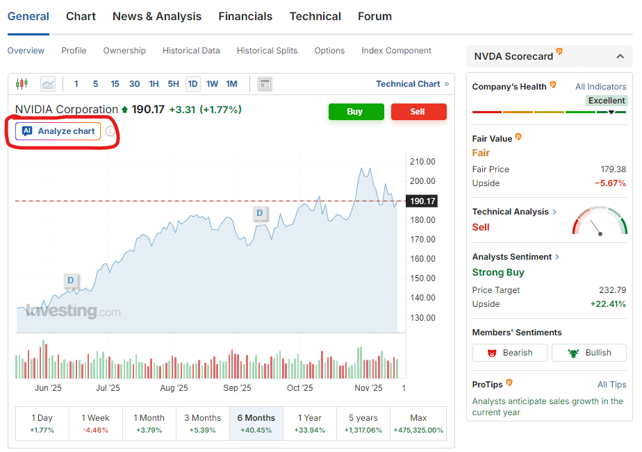
Investing.com’s exclusive WarrenAI tool cuts through the noise. Simply navigate to any stock, crypto, or commodity page on Investing.com and click ‘Analyze Chart’ button (as shown below).
The Essential Anatomy of a Stock Chart
Before you can start reading line charts for stocks, you need to understand what you are actually looking at. A line chart is the simplest form of price chart, built by plotting a single data point over time and connecting those points with a line.
A stock chart has two primary axes:
- The Horizontal Axis (X Axis): Represents Time. This can be days, weeks, months, or years, depending on the timeframe you select.
- The Vertical Axis (Y Axis): Represents Price. This displays the stock’s monetary value.
Why the Closing Price is the Only Story
The key to a line chart’s power is its simplicity. Unlike more complex charts, the line chart typically uses only the closing price for each period.
Why is the closing price so significant? We like to think of it as the Market’s Final Vote.
During any trading day, a stock’s price will fluctuate wildly, hitting a high and a low as bulls (buyers) and bears (sellers) battle it out. However, the closing price represents the final consensus—the price at which the market officially settled for that period. Because it strips away all the intraday noise (the temporary highs and lows), the closing price gives a much clearer, less emotional picture of the true trend.
Step by Step Line Chart Technical Analysis
The primary use of the line chart for line chart technical analysis is to establish the direction of the market. This is the first, most crucial step for any long term investor.
Identifying the Three Major Stock Price Trends
By smoothing the data, the line chart makes stock price trend analysis crystal clear. You only need to look for these three patterns:
- Uptrend (The Rally): The line chart shows a series of higher highs and higher lows. The line is clearly moving from the bottom left of the chart toward the top right. This confirms that buyers are consistently stronger than sellers over the long run.
- Downtrend (The Decline): The line chart shows a series of lower highs and lower lows. The line is moving from the top left toward the bottom right. This signals that sellers are in control, and the stock is struggling to maintain its value.
- Sideways/Ranging Trend (The Pause): The line chart moves horizontally, without forming a clear series of higher highs or lower lows. This indicates that the market is in a period of indecision or consolidation, where buyers and sellers are equally matched.
Drawing Support & Resistance (The Price Floor and Ceiling)
Once you identify the trend, you can use the line chart to identify two of the most fundamental concepts in technical analysis: Support and Resistance.
- Support (The Floor): This is a price level where the stock’s line has consistently reversed its decline and turned back up. It represents a price point where demand (buying interest) is strong enough to absorb the supply (selling pressure). To find it, look for at least two or three previous troughs (low points) on the line chart that align horizontally.
- Resistance (The Ceiling): This is a price level where the stock’s line has consistently reversed its advance and turned back down. It represents a price point where supply (selling pressure) is strong enough to halt the demand. To find it, look for at least two or three previous peaks (high points) that align horizontally.
Practical Application: Support and Resistance levels drawn on a line chart are often considered more reliable for long term investing because they are based on the closing price significance, not just temporary intraday wicks.
Line Chart vs Candlestick: The Power of Simplicity
If you’ve seen other charts, you may wonder why you should bother with the simple line chart. This question, “Which is better: line chart vs candlestick?” is one of the most common for new investors.
Line Chart as a Noise Filter for Long Term Investors
The line chart excels as a tool to prevent analysis paralysis. Candlestick and bar charts provide four pieces of data (Open, High, Low, Close) for every period. While this detail is essential for short term traders who need to react quickly to volatility, it can be overwhelming for beginners or long term investors focused on a 5 or 10 year horizon.
The line chart’s deliberate filtering of the open, high, and low allows you to focus solely on the trajectory. By cutting out the temporary drama, the line chart ensures your investment decisions are guided by the overall direction, not momentary panic or excitement.
The Risk of Missing the Daily Battle
A balanced approach requires highlighting the line chart’s main risk: it doesn’t show the intraday volatility.
For example, a stock could have a massive selloff during the day (hitting a very low price) but rally back to close exactly where it started. A line chart would show a flat line, but a candlestick chart would show a “Hammer” pattern, indicating a major rejection of lower prices.
By only looking at the line chart, you miss this crucial information about market sentiment. This is a risk that must be managed, which leads to our next strategy.
Applying the Line Chart: Multi Timeframe Analysis
To mitigate the risk of simplicity while maximizing the line chart’s clarity, professional investors use a constructive strategy called multi timeframe analysis.
The goal is to use the line chart to define the long term trend and only look at detailed charts (like candlesticks) for fine tuning entry or exit points.
- Start Broad (The 5-Year View): Begin your reading stock market charts process by looking at the line chart over a 5 or 10 year period. Use this view to unequivocally determine the major trend (Uptrend, Downtrend, or Sideways). This confirms the fundamental health and trajectory of the company.
- Zoom In (The 1-Year View): Once the long term trend is confirmed, zoom in to the 1 year line chart. This is where you draw your most actionable Support and Resistance levels.
- Confirm (The Detailed Chart): Only after steps 1 and 2 are complete should you switch to a more detailed chart (candlestick or bar) on the short timeframe (e.g., 3 months) to precisely execute a buy or sell order.
This systematic approach ensures your investment decisions are always anchored to the big picture provided by the simple line chart, minimizing impulsive trades based on short term noise.
Conclusion
For the new investor, mastering the art of reading line charts for stocks is the most powerful first step you can take. By focusing on the closing price significance, you filter out the daily distractions and gain crystal clear insight into the true direction of a stock.
Remember the metaphor: the line chart is your investment GPS, guiding you along the broad highway of the trend. Use it to identify support and resistance, define the overall trajectory, and save yourself from analysis paralysis.
Start your journey with simplicity; once you are comfortable with the clarity of the line chart, you can confidently explore more complex charting methods.
Institutional-Grade Analysis, Immediate Results 🔎⏱️
The market moves fast, so make sure your insights move faster. Access WarrenAI’s instant technical analysis alongside the full suite of InvestingPro tools, including proprietary fair value calculations, financial health scores and AI-powered ProPicks.
Unlike other AIs that only analyze numbers, WarrenAI indentifies visual patterns (candlestick formations, support levels, and trends) that make or break trades.
What WarrenAI Does Instantly: 🤖
🔎 Technical Summary: Provides a plain-language analysis of the current market structure, including trend, momentum, and key S/R levels.
⚠️ Risk Identification: Points out potential downside risks or failed signals the chart is flashing.
💡 Opportunity Spotlight: Highlights confirmed buy/sell signals based on institutional-grade algorithms, giving you a definitive edge.
🗺️ Trading Plan: Receive specific entry, stop-loss, and profit target prices based on technical analysis and risk/reward calculations that spot opportunities humans often miss.
Stop wasting time doing everything manually. Leverage WarrenAI to gain an instant edge to trade any market – across crypto, forex, commodities, stocks, ETFs and indices. Capture opportunities wherever they emerge, filtering hours of analysis into a concise, actionable report. Don’t get left behind. Start your InvestingPro membership today.


